The 2022 NY Type Directors Club Exhibition
Individual Letter Poster
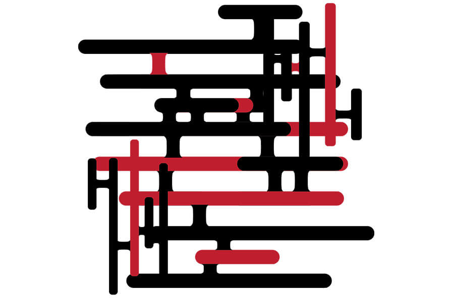
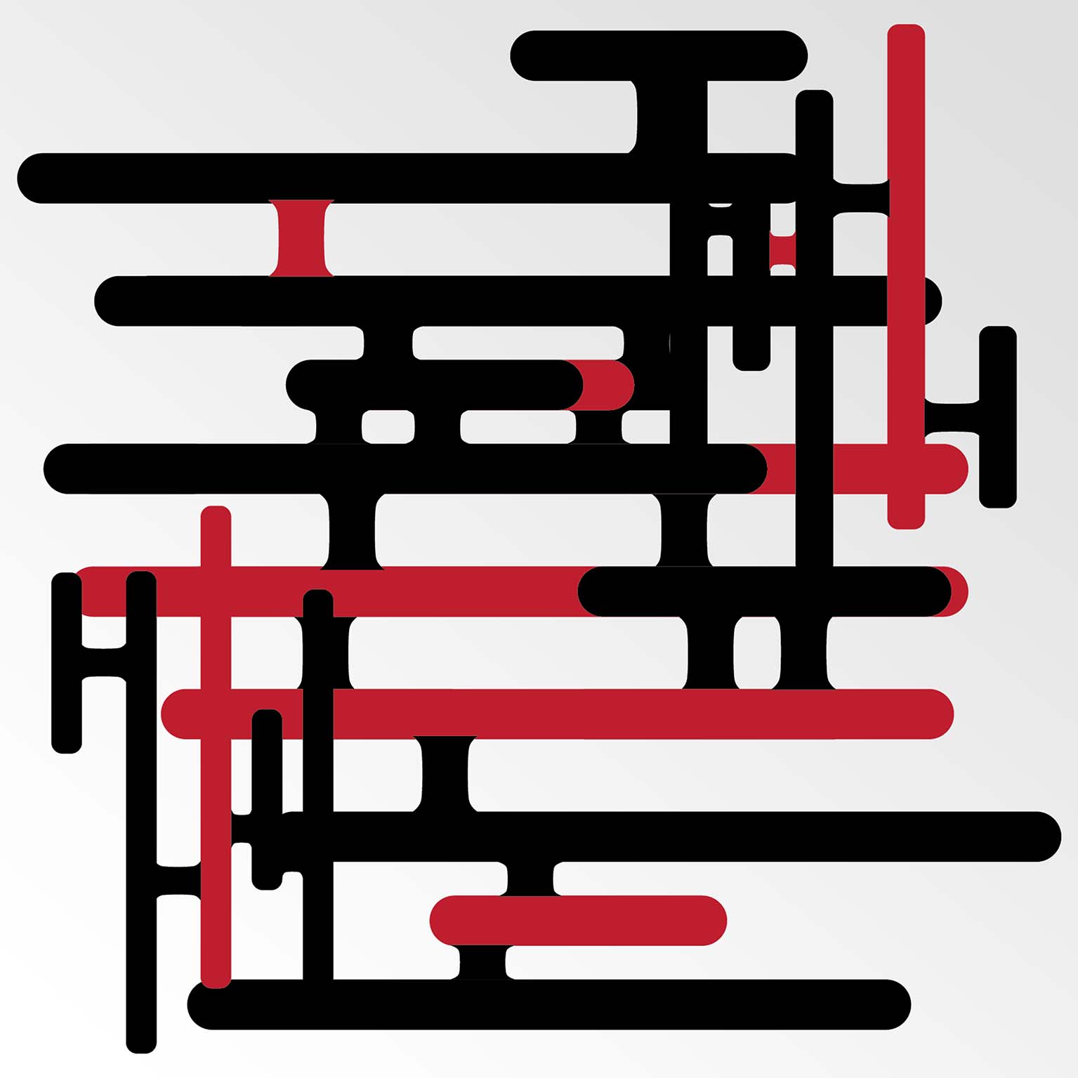
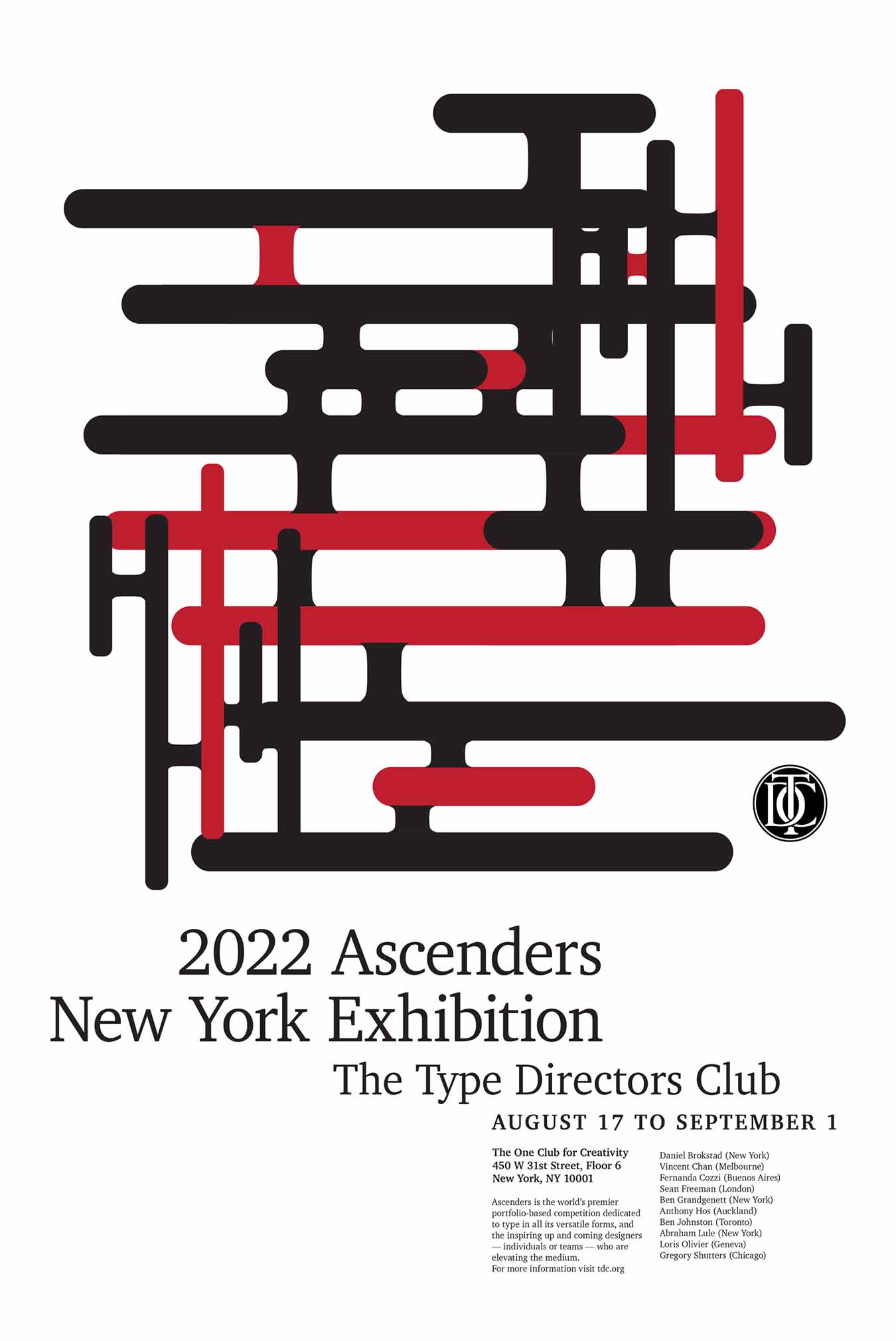
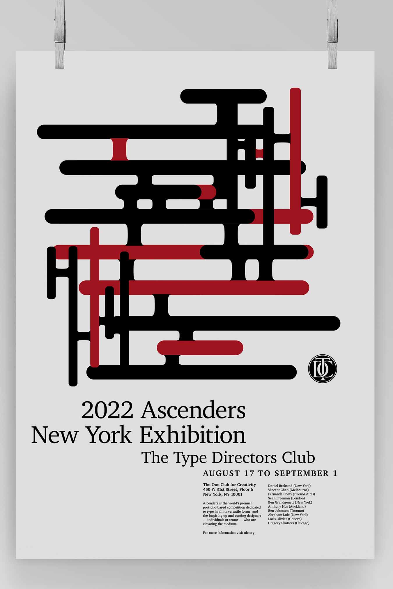
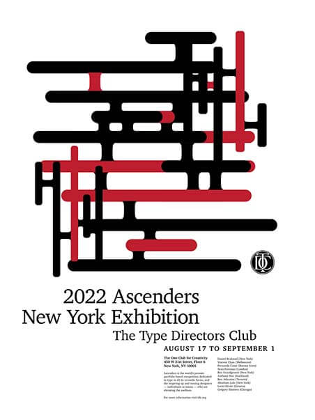
The Type Directors club hosts and creates exhibitions in New York City and produce traveling exhibitions that appear around the world. The concept for this design was that the journey that one takes in the art world is complex and can lead to many different opportunities. To achieve this, a pattern of connected lines was repeated, and re-adjusted to create a complex-looking collection of intersecting lines. Red accents were added for aesthetic value and contrast as no one path is the same. The design works because the elements of the poster aren’t conflicting with each other but creating a sense of harmony and balance using whitespace and type/image hierarchy.
